Friday, June 1, 2012
Letters In Nature
For this project, I didn't exactly use nature, however I used other objects to form the letters of my name. I put a skinny black border around each of the images in Photoshop, and a border with the stroke effect around the entire image.
Monday, May 7, 2012
Wedding Singer
This is a poster that I designed to advertise the school musical. For this project I started off by making a border with the Rectangular Marquee tool. I then filled the border with both a blue and pink color. Then, I took an image of The Wedding Singer logo and placed it inside the border. I then chose a font and arranged all of the details of showtimes and ticket prices onto the document.
Layers
For my layered images, I edited them very little in Camera raw. I only upped the contrast and clarity on most of them. For the the later composite, I used the layer mask and lowered the opacity of the two smaller images. The goal was to combine several of my layering images to make a collage/ composite.
White Balance
White balance allows you to adjust the color of a picture for shooting under different kinds of light. I shot several kinds of white balance. I shot auto, custom, and tungsten.
Friday, February 24, 2012
Silhouettes- Photographs
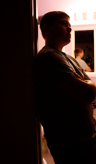
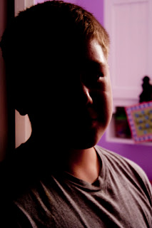
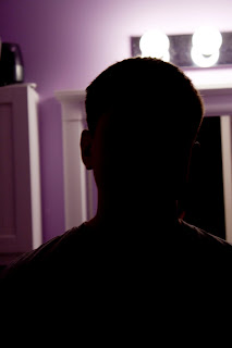
When photographing silhouettes,your light source has to be right behind your subject. The light should be strong enough to overpower your subject, so that there isn't as much detail. For my photographed silhouettes, I put my subject right in front of my light source. There was still some detail in my images, but I was pleased with the amount. I edited my images in Camera Raw a little bit. I changed the white balance on some of them to tungsten, so that my wall had a little more color to it. I also upped the contrast, and the blacks a little bit.
Silhouettes

A silhouette is an image of a person, object, or scene that consists of the outline and a basically featureless interior. The silhouetted object is usually black. For my own, digital silhouette, I uploaded an image of myself, and selected it with the quick selection tool. Then, I used the paint bucket tool and filled the photo with black. after that I filled the image with things that I enjoy. I uploaded an image of a piano, and a stage. I also uploaded some stage lights, and changed the hue and saturation so that the colors appeared more different. At the bottom of my picture I uploaded an image of a crowd. I put an outer glow on them.
"Just Stop" Logo
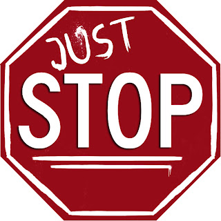 This project was for a bullying campaign at school. The people in charge wanted a simple, once color logo that got their point across.
For this project, I got an image of a stop sign from the internet, and selected it with the lasso tool. I also selected the letters, and copied and pasted all of that on to a new document. To make the outline lines around the stop sign, I used a brush. I changed the andle of each line so that is would properly connect with the others. For the writing on the sign , ("just') , I downloaded a graffiti font. I also downloaded some spray paint brushes to add on the sign.
Subscribe to:
Comments (Atom)


